Memories App for Past
Loved Ones
Overview
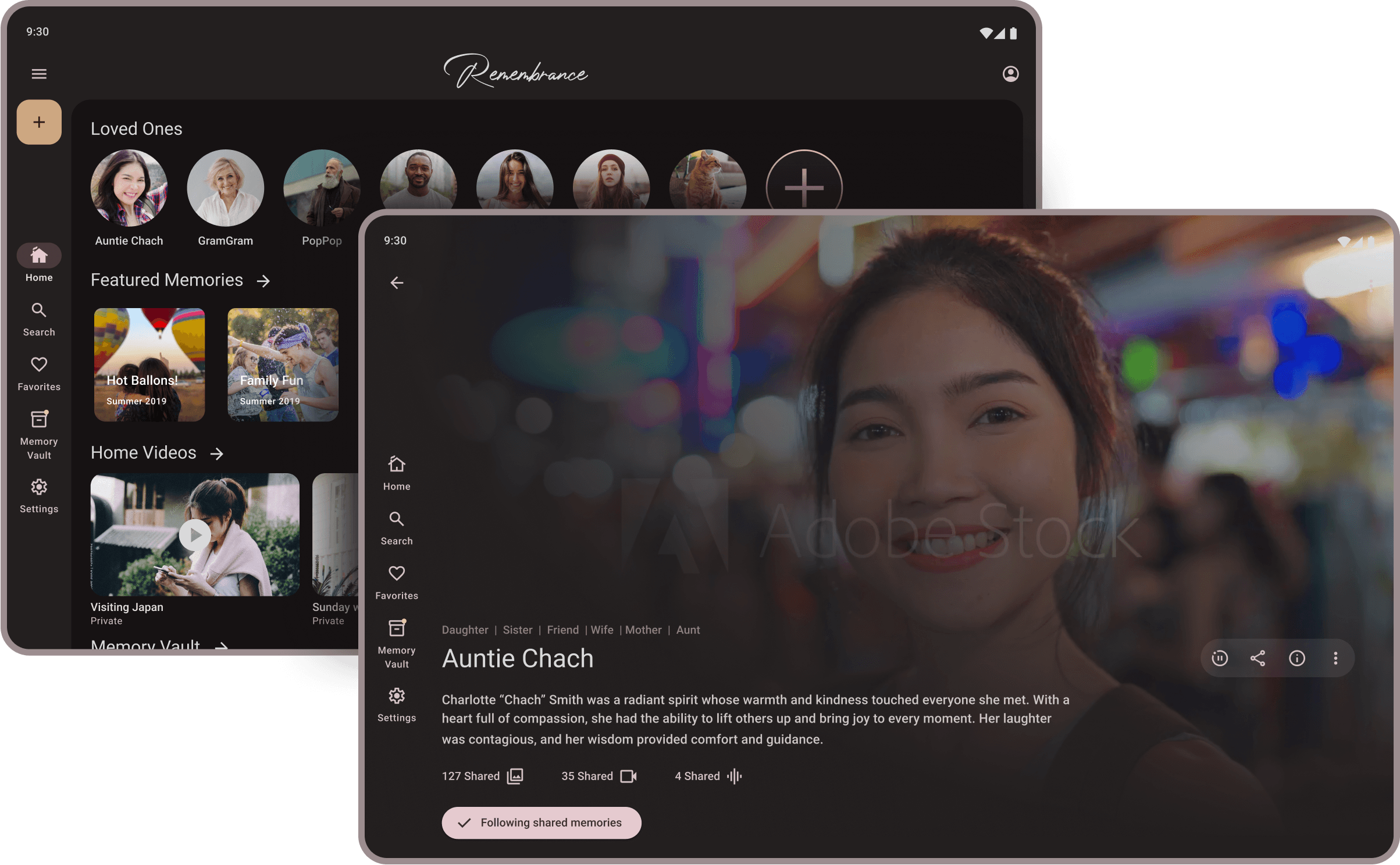
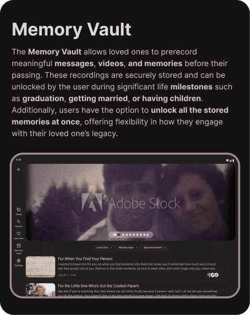
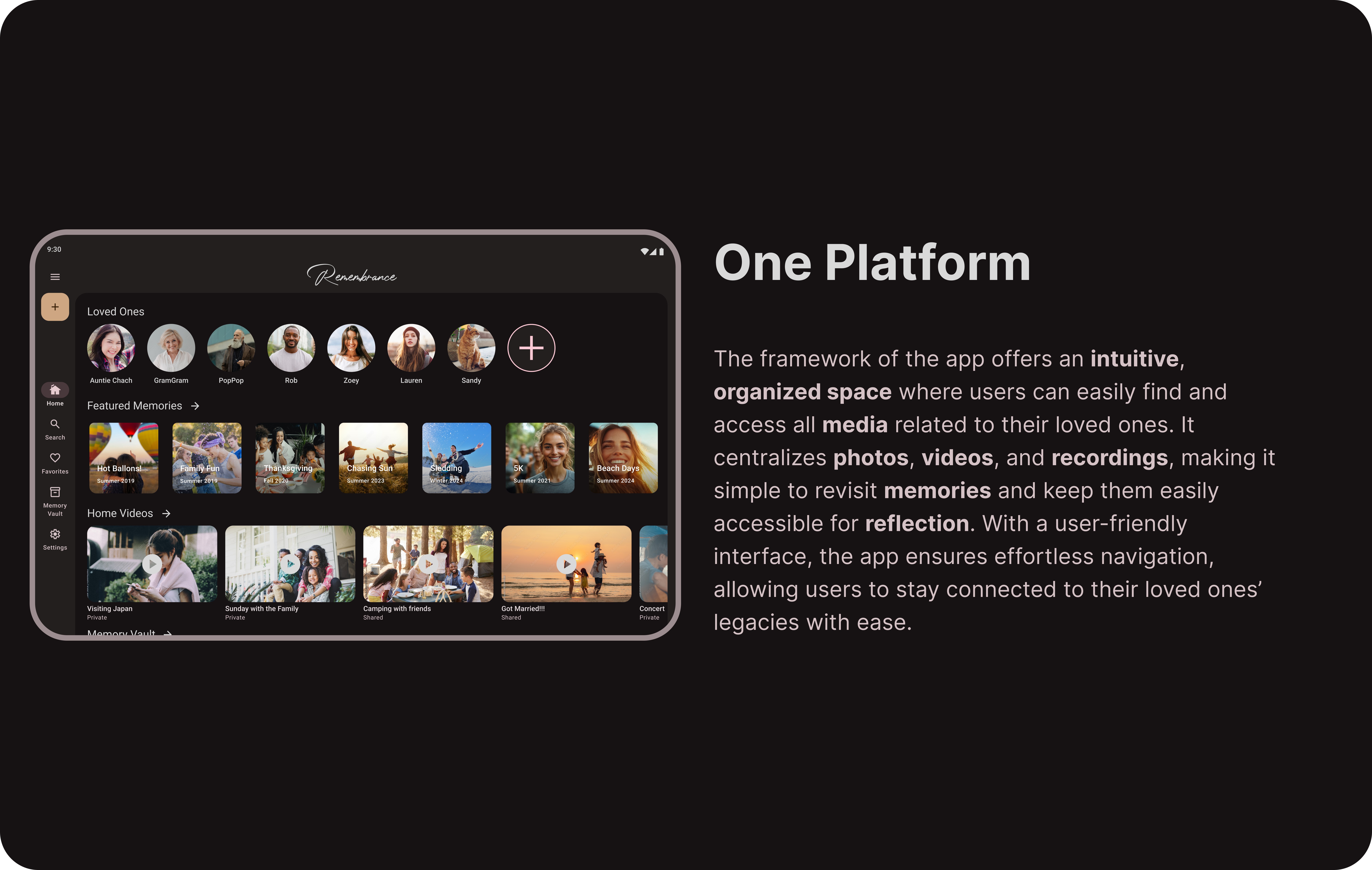
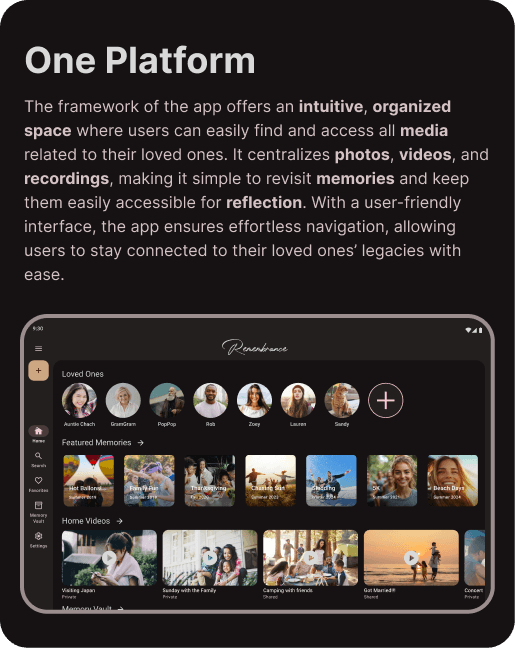
The remembrance app helps users stay connected to past loved ones through meaningful digital keepsakes. It offers a space to store and revisit home videos, audio recordings, and milestone-locked messages recorded before their passing. Inspired by the power of memories, the app creates an interactive way to preserve voices, stories, and personal moments.
Team
Sole Designer
Responsibilities
User Research
Wireframing/Prototyping
UX/UI Design
Usability Testing
Duration
Oct 2024 - Feb 2025
Inspiration
The idea for this app emerged as news stories surfaced about people creating AI voice clones of past loved ones. These stories raised ethical and moral questions about whether we should open that Pandora’s box. This sparked conversations and interviews that delved into how people want to authentically preserve the essence of their loved ones, guiding the development of the app.

"Absolutely not. That is very creepy. I would be weirded out by hearing the voice of someone who died. That makes me uncomfortable."
-Anonymous Tester
Problem
As technology evolves, traditional ways of preserving memories are fading, with aging home videos and photos becoming harder to revisit and handwriting becoming less common. Without a dedicated space to reconnect, memories of loved ones remain scattered across different platforms and formats. There is a need for a solution that thoughtfully preserves and presents their stories, voices, and presence in a meaningful way.
Solution
I designed a solution that transforms scattered home videos and recordings into a meaningful digital legacy. The platform’s core innovation is a "future-delivery" feature, enabling users to record messages for their families to revisit long after they are gone. This creates a bridge between generations, ensuring that the stories and voices of loved ones are never lost to time.


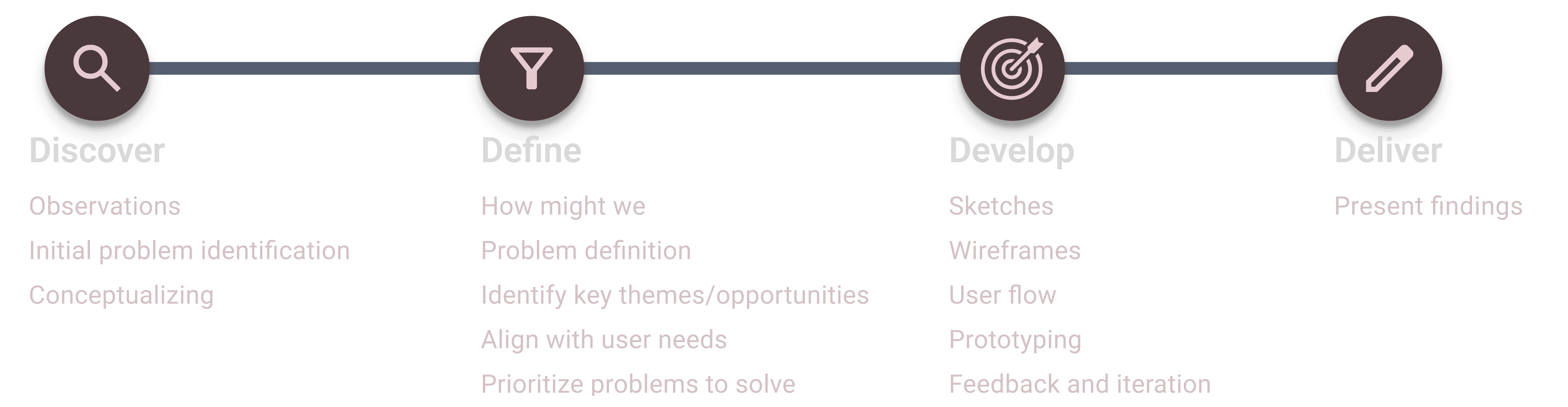
Design Process
I started by researching how people manage the digital assets of loved ones, which revealed that standard storage tools often feel too clinical for such personal memories. I moved directly into wireframing and prototyping to focus on how users would actually interact with audio and video content. User feedback drove the development, leading me to prioritize a warm interface that centers on the "Memory Vault" and personal storytelling.

Interview Insights
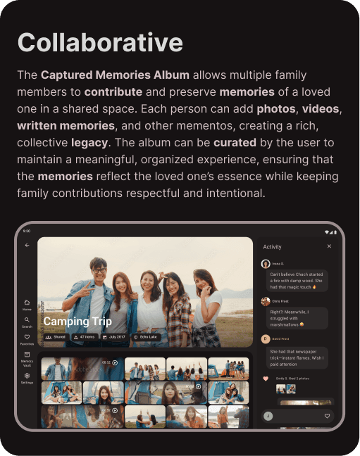
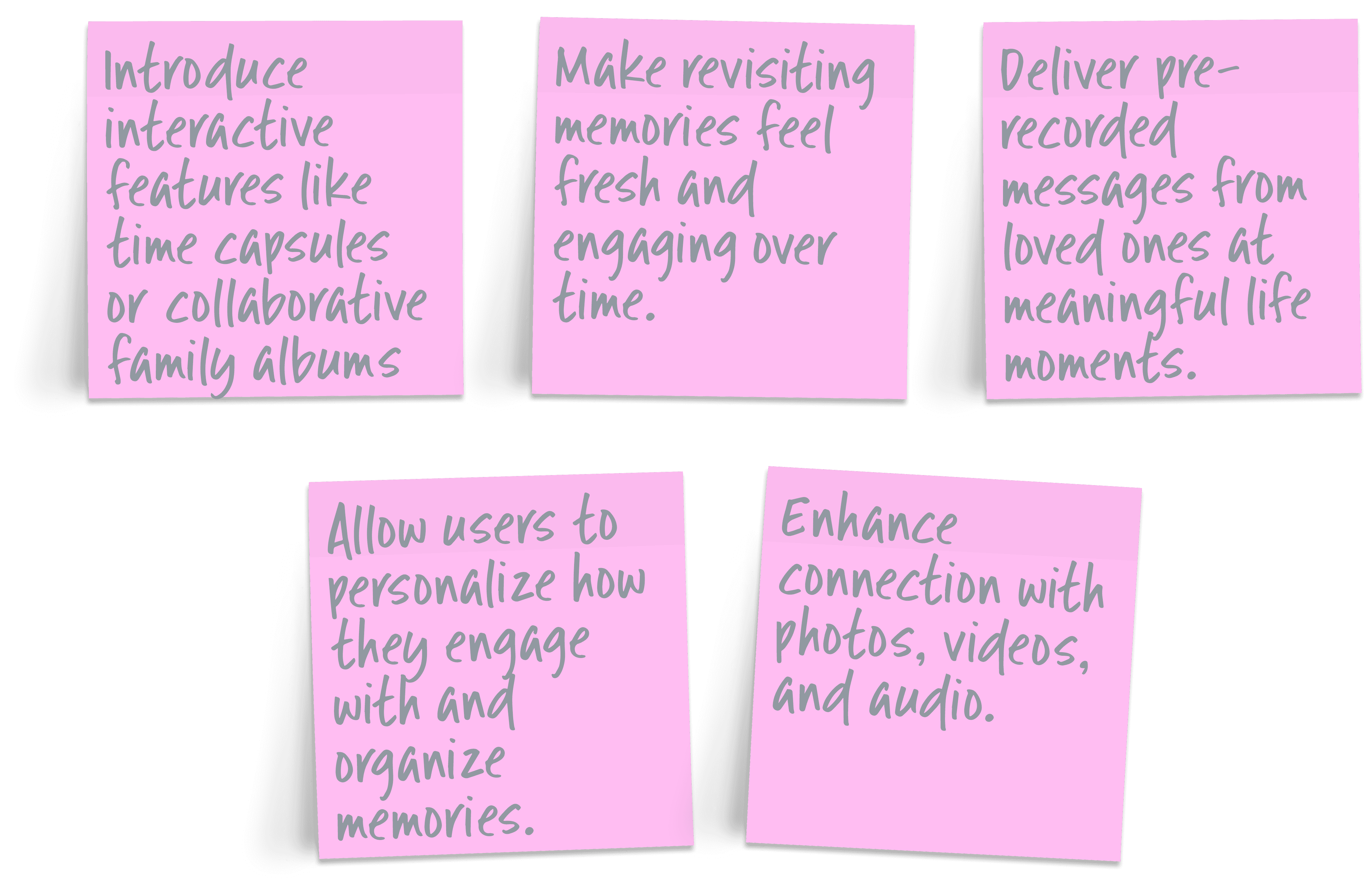
Individuals who have experienced the loss of a loved one provided a deeper understanding of how they navigate grief and preserve memories. These conversations shed light on the emotional significance of digital remembrance and the ways people want to stay connected to those they’ve lost. This insight led to a key realization about the importance of collaborative memory-sharing, prompting additional exploration into how families and friends can contribute to a shared remembrance space.
"I wish I could hear her voice again. I wish I could talk to her. I wish she could give me advice like she used to. I really miss her"
-Anonymous Tester


Design System
The design system for Remembrance utilizes a dark mode interface to create a calming and intimate environment. Built upon the Material Design framework, the system provides a cohesive and accessible foundation for typography, iconography, and interactions. A warm, cherry blossom-inspired pink (#FDC9D4) is used as the primary accent, providing emotional depth while maintaining high readability against the dark background. This combination ensures the interface is visually harmonious and grounded in established usability standards.


How Might We
The "How Might We" methodology provided a structured way to address the specific needs and concerns identified during the research phase. This approach ensured that the design moved beyond basic functionality to solve the actual emotional challenges users faced. The resulting features are a direct reflection of that feedback, prioritizing a supportive and personal experience.
Sketches
I mapped out the core experience and interactions to explore how users would navigate the most critical features before moving to digital tools. By starting on paper, I was able to iterate quickly and ensure the foundation of the design remained focused on accessibility and usability.


Low-Fidelity Prototype
Translating initial sketches into a clickable experience allowed for early testing of the app's structure and user flow. I incorporated higher fidelity placeholders to better evaluate the emotional feel and spatial arrangement of key elements before finalizing the visual style. This stage helped identify pain points and refine interactions, ensuring the experience remained seamless and grounded in user needs.


Usability Study
The unmoderated usability study provided an objective evaluation of how participants navigated the interface and interacted with core features. Testing revealed unintended friction regarding specific iconography and terminology that conflicted with the app's supportive tone. These insights directly drove the iterative refinements seen in the Memory Vault, ensuring the final design remained seamless and resonant.

Design Iteration
The development of Remembrance was shaped by user insights and testing to enhance both functionality and emotional impact. Adjustments focused on storytelling elements, optimizing the Memory Vault, and ensuring a visually soothing interface. This approach resulted in a design that feels intuitive, personal, and deeply meaningful.

For the first version, the focus was on the login screen. A tester noted a preference for using social media credentials to sign in, a feature missing from the initial design. In response, the login screen was updated to include SSO options, improving convenience and aligning with user expectations.

During the second iteration, testing revealed a desire for family members to interact directly with shared media. This feedback led to the development of a social layer, incorporating user avatars and names to create a more personal and engaging commenting experience.

In the third iteration, testers expressed concern that the lock icon and the term "Locked Memories" implied a paywall or felt "gamified." To address this, the wording and iconography were refined to ensure users understood these memories surface naturally over time, preserving the app’s emotional intent.
Final Design


Accessibility Considerations
Accessibility was a core priority for, ensuring an inclusive and user-friendly experience for all. I designed with a wide range of needs in mind, incorporating features that remove barriers and improve usability for people with varying abilities. The following examples highlight how these considerations shaped the app's development from the start.


Identifiers: To ensure all users could easily distinguish media types, I incorporated distinct icons for video, audio, and documents. These identifiers also visually indicate whether a file is currently within the Memory Vault, providing a clear and predictable way to navigate the interface. This approach reduces cognitive load and ensures that media status is accessible at a glance, regardless of how a user interacts with the app.

Visual Comfort: The interface was designed with a native dark mode to reduce eye strain and improve readability, especially during sensitive or late-night use. This choice supports users with light sensitivities and ensures the interface remains accessible across various lighting conditions. By designing for visual comfort from the start, I created a more sustainable and inclusive experience for everyone.
Retrospective Competitive Audit
Analyzing the competitive landscape post-design confirmed that the only direct competitor, SafeBeyond, was acquired by a global insurance firm and transitioned into a corporate white-label tool. This shift left a clear void in the market, validating the need for a warmer, consumer-facing sanctuary. These findings reinforced that the app effectively fills an emotional space that general photo storage or social platforms currently neglect.


"I wish that this had been available before my granny died."
-Anonymous Tester
What I Learned
I've learned that every emotion comes with an app such as this one. From one tester asking the need for an app like this, when "we perfectly have photo albums for things like this" to another tester choking up during the session, wishing they had something like this for when their grandmother passed away.
I've learned that there is excitement and hesitations within this concept. The excitement is around having a "one stop shop" for these memories. Having them all in one place, especially if it was something that the whole family could use and upload to. I learned that people like the idea of having this "digital graveyard" to go to and feel like they are visiting their loved one. One user said it felt disrespectful to have their meories live anywhere else online except something such as this. Almost as if facebook or instagram "wasn't good enough".
The hesitations that I saw were mostly around the AI features. People felt that it was "creepy" and "disrespectful" to have this, especially if they were not asked about it directly from the loved one who passed. They did however, like the idea of having messages and videos sent to them on milestone dates like a wedding or birthday, if the loved one had recorded it before passing. I also noticed that almost everyone said they would need time to heal in order to even think about using an app such as this. It was mentioned many times that it would be "too hard" or "too emotional" to use something like this in the early stages of grief.
